
Breadcrumb
General considerations
| 1. Menu items use a capital letter at the beginning of each major word (all words except articles, conjunctions and prepositions) |
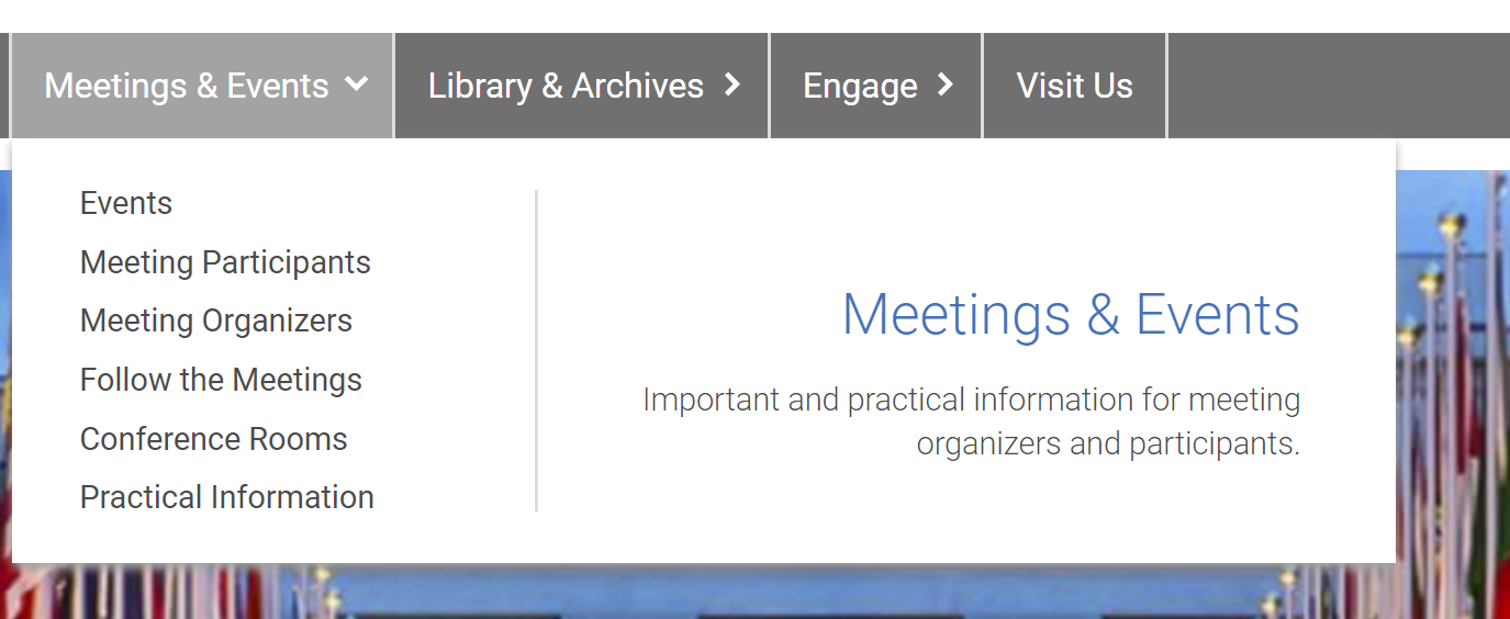
|
| 2. Page headings use a capital letter only for the first word and proper nouns. Section headings on ungeneva.org pages and headings for boxes are currently automatically written in all caps as a stylistic means. To allow for future changes: don’t use all caps for other content. Don’t use all caps in the backend for section headings or box headings, but apply the rule for page headings. |

|
| 3. For certain website elements, such as button or card links, captions and other highlighted content, the first word will be capitalized, in addition to proper nouns. In a table, the first word in every cell is capitalized. |

|
| 4. All UN entities and offices, departments and divisions, as well as functional/job titles, are capitalized. This also applies to other entities potentially mentioned on the website. It also holds true when only a part of the title is repeated later in the text. But: titles are only capitalized when they are concrete. |
|
| 5. Official names are capitalized. These include international days or other events, programmes or projects, or any other official initiative. | “Summit of the Future”, the “Awake at Night” podcast, “United Nations Decade of Ocean Science for Sustainable Development” |
| 6. Commonly used terms, are often erroneously capitalized. Do write these terms in lower case unless they form part of an official name. | “press release”, “human rights”, “holiday calendar”, “security update” or “cultural activities” |
| 7. Small letters in proper nouns, names or fixed expressions are written as small letter, even at the beginning of a heading, title, a style element, table or list. | e-subscription, iSeek |
| 1. As much as possible, use abbreviations only when they are widely known. It is cumbersome to read a text with many abbreviations, even if they have been written in full at the beginning of a text. | UN, UNICEF |
| 2. If abbreviations must be used because a lengthy term is being used several times in your text, write the term in full at the beginning of the text and introduce the abbreviation in brackets after. | The United Nations Declaration on the Rights of Indigenous Peoples (UNDRIP) |
| 3. Do not introduce an abbreviation if it is not being used later on in the text. |
| 1. Fonts, font size and colour are automatically determined according to content type and cannot be changed. In a rich text field, the font size can be adjusted to mark a heading. It should only be used for this purpose, and not to highlight a word or phrase. | |
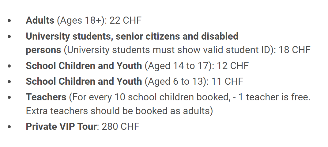
2. Bold print in running text can be used as follows:
|
|
3. Italics can be used for:
Italics should not be used to highlight text. | |
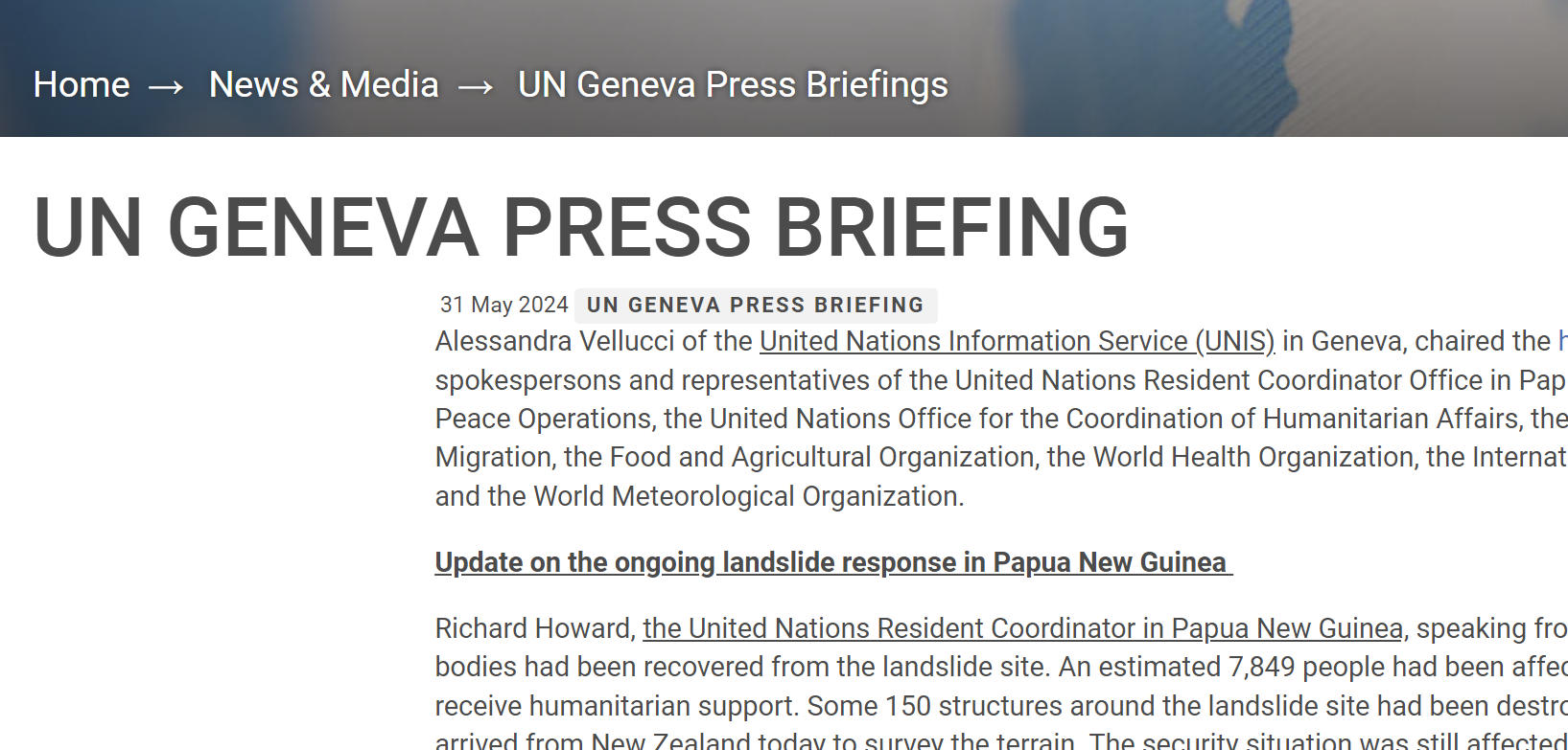
4. Underlined text can be used for the following:
Some style elements, such as section headings, are automatically underlined. Text should not be underlined to highlight pieces of running text. |
|
| 5. All caps must not be used for any piece of content. Some style items will automatically be displayed in all caps but should be entered in lower case/according to the writing conventions. |
Address details
Address details should follow the mailing conventions of the specific address location. Postal addresses in Switzerland follow the below convention. House numbers are written after the street name.
| Private address | Company's address | P.O. Box address |
First name and surname Street & house number, plus additional information (e.g., apartment/floor no.) Postcode and town (Country) | Company name Recipients name if addressed to a specific person Street & house number Postcode and town (Country) | The penultimate address line must indicate “P.O. Box”. Any additional number for the P.O. Box location appears on the last line after the town. |
Mr Erich Müller Bahnhofstrasse 4a/8 8001 Zürich | Müller Ltd Mr R. Bürki Zollikerstrasse 788 8008 Zürich | Schweizer Ltd P.O. Box 3000 Berne 8 |
Phone numbers
Phone numbers use the following structure (without any parentheses or hyphens):
With country code: +41 22 444 5555
Without country code: 22 444 5555
To indicate a phone number, write “Tel:”. Fax numbers are no longer being added to the website.
Honorifics are only used in Blue Book entries, for officials’ biographies (i.e., in the sections of the Senior Management Team, former Directors-General, and in the presentations of credentials), as well as in agendas with speakers (such as cultural events). In the Blue Book, a honorific precedes every name. In biographies, a honorific is used with the full name at first mention. In later mentions, the name can be used with or without honorifics, or with the honorific replacing the first name. In an agenda, names of speakers are preceded by a honorific.
Numbers
The Editorial Manual gives comprehensive information about the use of numbers. Some common conventions:
1. Usually, numbers are expressed as words:
|
|
2. Numbers are always expressed in figures:
| |
| 3. Millions, billions or trillions are accompanied by a (decimal) numeral. | 1.5 million inhabitants |
Dates
| Dates are written without any punctuation and spell out the month. | 12 January 2023 |
Times
| Times are being indicated in the 12-hour system, indicating the hours between midnight and midday (a.m.) or between midday and midnight (p.m.). Hours and minutes are separated by a point. Full hours do not show any minutes. | 9 a.m., 8.30 p.m. |
| 1. List can be created in the rich text editor, either using bullet points or using enumerations. |
|
| 2. In lists with short items, no punctuation should follow the items. In more complex constructions, especially if the items consist of full sentences, a full stop may be used after each item. Semicolons should not be used. | |
| 3. No “and” or “or” should be used at the end of any of the list items. No punctuation should be used when the list items form a sentence only together with a lead-in phrase. The lead-in phrase should end with a colon. | Poor sleep quality has been linked with:
|
| 4. List items should begin with a capital letter only if the items are complete sentences. | Infants often display prosocial behavior - that is, behavior intended to help others - when interacting with their parents, as demonstrated in the following examples (Hammond & Drummond, 2019):
|
Wherever possible, content should be placed on the webpages directly, and file attachments are to be used sparingly and in specific cases (e.g. forms to be filled in by users, legal documents and other files that are too detailed to be added to the website directly). Either word (.doc/.docx) or pdf files can be uploaded. File attachments should follow the following naming conventions:
- The file name should explain its content but not include too many details. It will be displayed in the URL.
- Do not use any spaces. Use dashes instead.
- All characters should be written in lower case.
- Don’t use special or accented characters.
- Indicate a language code inside the file name. The file name should be in English.
- Include a date (the year is sufficient).
Example: how-can-ngo-representatives-attend-meetings-2024-en.pdf
Style elements on the website
There is a hierarchy of heading sizes on each page as shown in the image:
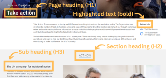
| 1. Page headings follow the same conventions regardless of their type (i.e., press release, news item, landing page, event, etc.). | |
| 2. A page heading should be concise. | |
| 3. Only the first letter and proper nouns or names are capitalized. Event headings can be capitalized according to the event name. | French Language Day 2023 |
| 4. Event headings should include only the name of the event. Date, time and venues will be in the description on the page. | (see above) |
| 5. Avoid abbreviations in headings. | |
| 6. Headings for press items do not need to include the press item type as the category is defined in the metadata and displayed on the page. |
One web page can be divided into several sections to group its content. Sections may have a heading and several style elements (e.g., columns, rich text, images or embedded videos, links etc.). To consider:
| 1. Alternate the background color from section to section (white/light grey). |

|
| 2. Currently, section headings are automatically written in all caps as part of our theme. In the backend, don’t use all caps, but opt for the same writing style as for page headings. | |
| 3. Sections give the users freedom to adapt the design and layout. It should, however, have an internal structure with regard to image sizes, text, number of columns, headings, etc. |
| 1. Use “telling” descriptions to link to related content. For accessibility reasons, avoid generic link text such as “read more”, “more”, “further information”, “here” etc. | Learn more about the UN Geneva Library |
| 2. Link text does not need to be highlighted in any form. It will automatically be displayed in blue font instead of black in rich text fields. |

|
| 3. When linking to a page with a different language than the source page, indicate the language change with the language code AR, EN, ES, FR, RU or ZH. | Watch League of Nations archival footage (FR) |
| 4. Link text should not be changed to bold, nor to italics. All text links should be displayed as paragraph text when added to a rich text. | |
| 5. Button links or cards can have a call to action or just some key words. Where possible, the link text should not exceed two lines. Only the first word and proper nouns are capitalized. |
|
| 6. Don’t use a full stop nor an exclamation mark at the end of a link item. These should only be used if a link forms, or is at the end of, a complete sentence in running text. |
| 1. Boxes can be used flexibly, with or without an icon, or a topic on the left. Headers, button links or images can also be added to boxes as needed. |
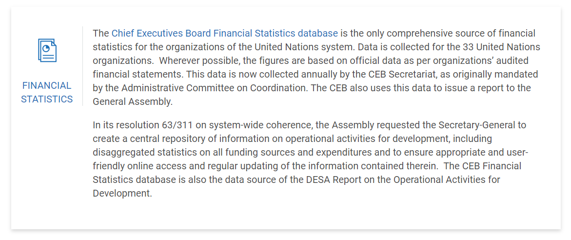
|
| 2. Two boxes in two columns should apply the same style. |
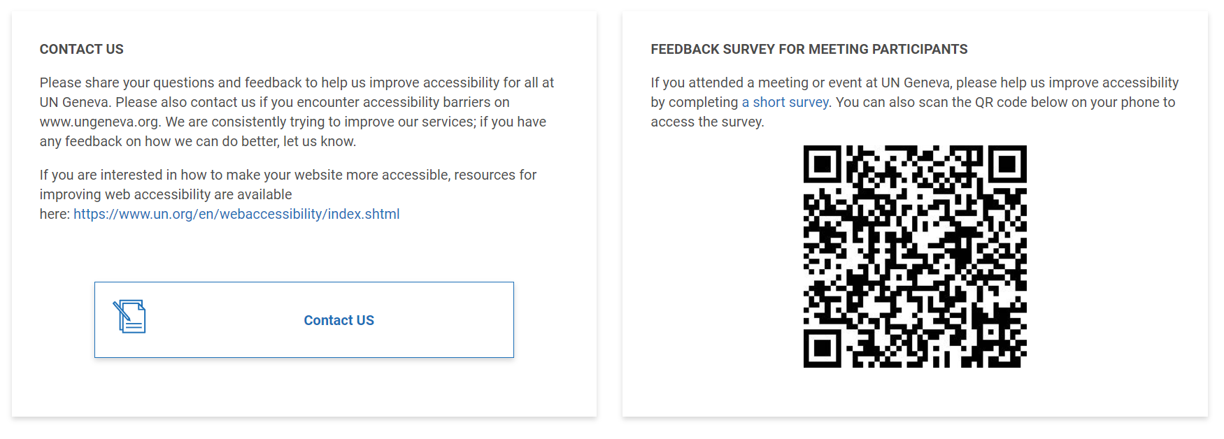
|
| 3. Careful with the use of boxes in three columns: depending on the text, the boxes might overlap, and another style solution needs to be found. |
| 1. Use the alt text field for every image upload. It can be read by screen readers thus providing persons with visual impairments with the necessary information about the image. Alt text should be a plain description of the image without any interpretation. | A picture of the flower garden at the United Nation headquarters, can have the alt text "United Nations Headquarters' Flower Garden". If the flowers are red roses, it might be important to specify the type of flowers. The alt text could be instead "Red Roses at the United Nations Headquarters' Flower Garden". |
| 2. Images in two or three neighbouring columns should have the same size for a neat look. |

|
| 3. Consider the image size and proportions for different uses, as to avoid cutting important image information. This is particularly relevant for images with text. In rich text (running text), the image size is adjustable, and these limitations don’t apply. Use the cropping tool available to select the best image section for use in different formats. | |
| 4. When placing an image next to a text in two adjacent columns, it looks best when image and text have roughly the same height. This can be slightly adjusted by choosing different column widths (e.g., 25%/75% vs. 50%/50%). Image and text are always aligned at the top. Avoid adding empty lines to change the formatting as they will become visible on different screen sizes. | |
| 5. Before uploading an image, make sure that you have the image rights. Photos found on the internet must not be used. |
| 1. When using a sub heading inside a section, use H3 as heading size, following the page heading (H1) and section heading (H2) in descending relevance. A coherent heading structure is an important accessibility aspect. Should you wish to add another, lower heading level inside your rich text, use H4 or bold print (see “formatting content”). |
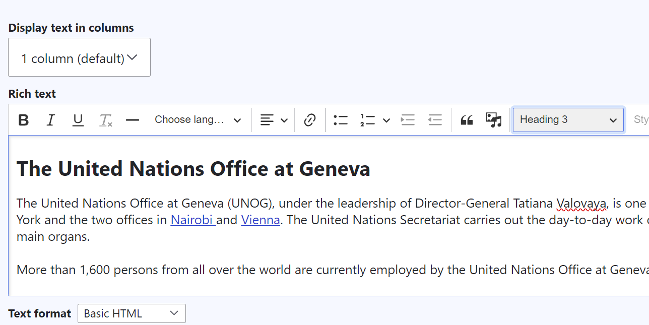
|
| 2. Do not use heading formatting for any content other than headings. | |
| 3. Content added to a rich text field should be, as much as possible, free from formatting. Remove especially the language codes when pasting the text or make sure to use a plain text editor such as Notepad (for a Windows PC) before copying your content on the website. | |
| 4. Formatting of rich text is done automatically in terms of text size, spacing, font, and alignments. Do not change the standard formatting by, e.g., adding spaces or lines. | |
| 5. Text in two or more adjacent columns should be split in approximately even parts for a balanced look. |
Spelling
Blue Book
Chef de Cabinet, Cheffe de Cabinet (for the English page, too)
Chemin de Fer Gate
Ciné ONU
civil society, civil society organization, CSO
disability inclusion, disability inclusive language
Director-General, Directors-General, Director-General’s
eLUNa
fundamental freedoms
gDoc
gMeets
Grab ‘n’ Go
grounds pass
human rights
Indico.UN
iSeek
man-made
Member State, Member States, State, States (if referring to a UN Member State or UN Member States)
non-member State, non-member observer State
observer State
organization, organize
Permanent Mission, Permanent Missions
Permanent Representative, Permanent Representatives
Peace Gate
Pregny Gate, Pregny Pavilion
programme
S.A.F.I. Shop
Strategic Heritage Plan (SHP) is an internal term and should not be used without further explanation. Where sensible, it can be replaced by more generic terms, such as “renovation works at the Palais des Nations".
UN funds, programmes and specialized agencies
Universal Periodic Review, UPR
UN Geneva vs. UNOG or United Nations Office at Geneva
The website mostly uses the term “UN Geneva” which is more inclusive of the UN system and its different entities in Geneva. This should be used when generally speaking about the presence of the United Nations in Geneva. “The United Nations Office at Geneva” or “UNOG” should only be used if a distinction from other UN entities in Geneva is necessary in the context. “UN Geneva” is used without an article.
UNICEF
UN Library & Archives Geneva, Library & Archives
UNOCHA, OCHA
website
web page
Punctuation
& can be used in website style elements, such as buttons or menu items, but should be avoided in plain text unless part of a title. Use a space before and after the character.
If using a slash (/) to separate words or parts of sentences, don’t use a space before or after. The slash will be the separating means.
Continue with small letters after a colon (:) or semi-colon (;). In English, there is no space before a colon or semi colon.
A full stop ends a sentence apart from the following exceptions:
- The sentence ends with an abbreviation which is indicated by a “.”.
- The sentence ends with a URL.
- The sentence ends with list items.
- A sentence ends with a bracket or with quotation marks and a full stop already indicates the end of a sentence inside the bracket or inside the quotation marks.
- A style element (accordion item heading or stand-alone text link) form a full sentence.
- The sentence ends with another special character indicating the end of the sentence (e.g., question mark, exclamation mark).
Quotation marks are only used to indicate quotes, not for other reasons, such as explaining words etc.
“” In a quote, a full stop will be placed inside the quotation marks if the entire sentence is inside the quotation marks. If the quote is a half-sentence, completing a sentence, the full stop is placed outside the quotation marks.
Questions?
Last update:
